Calming Pastels
Color paletteAbout
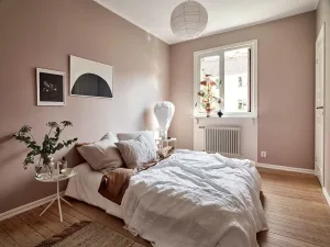
The Calming Pastels color palette is a serene and gentle collection of hues designed to evoke feelings of tranquility and peace. It features a range of soothing pastels, including barely-there blues that provide a cool and calming presence, warm blush tones that add a touch of soft femininity, and soft ivory shades that bring a sense of elegance and sophistication. These colors work together to create a harmonious balance that is both visually appealing and emotionally soothing. This palette is ideal for projects where a calming aesthetic is desired, such as wellness branding, lifestyle blogs, or minimalist designs. The combination of cool blues and warm blush tones creates a versatile palette that can be adapted to various design needs. Whether used in digital media, packaging, or interior design, Calming Pastels offers a refined and approachable look that enhances the overall ambiance of any space or product. Its understated yet charming quality makes it perfect for creating a peaceful and inviting atmosphere.